Project Overview
CorePlus Aerospace engaged me to develop a refreshed visual identity for its educational curriculum aimed at boosting program clarity, credibility, and student engagement. I crafted a refreshed logo, comprehensive brand guidelines, a parent-facing brochure, and an infographic that would serve as the visual and conceptual backbone for all brand outputs. Click here to the website brand expression!
Logo Development
I redesigned the CorePlus Aerospace logo to modernize its look and improve recognition across digital and print media.
The Challenge:
The existing logo lacked cohesion, hierarchy, and scalability for use in both large banners and small digital formats.
My Role & Process:
• Conducted a visual audit comparing previous logo treatments across applications.
• Refined typography, simplified iconography, and improved legibility at small sizes.
• Developed logo lockups for horizontal, stacked, and icon-only use cases.
The Outcome:
The new logo system increased clarity and brand recognition while enabling flexible usage across digital platforms, print applications, and promotional materials.
Logo Before Development
Logo After Development
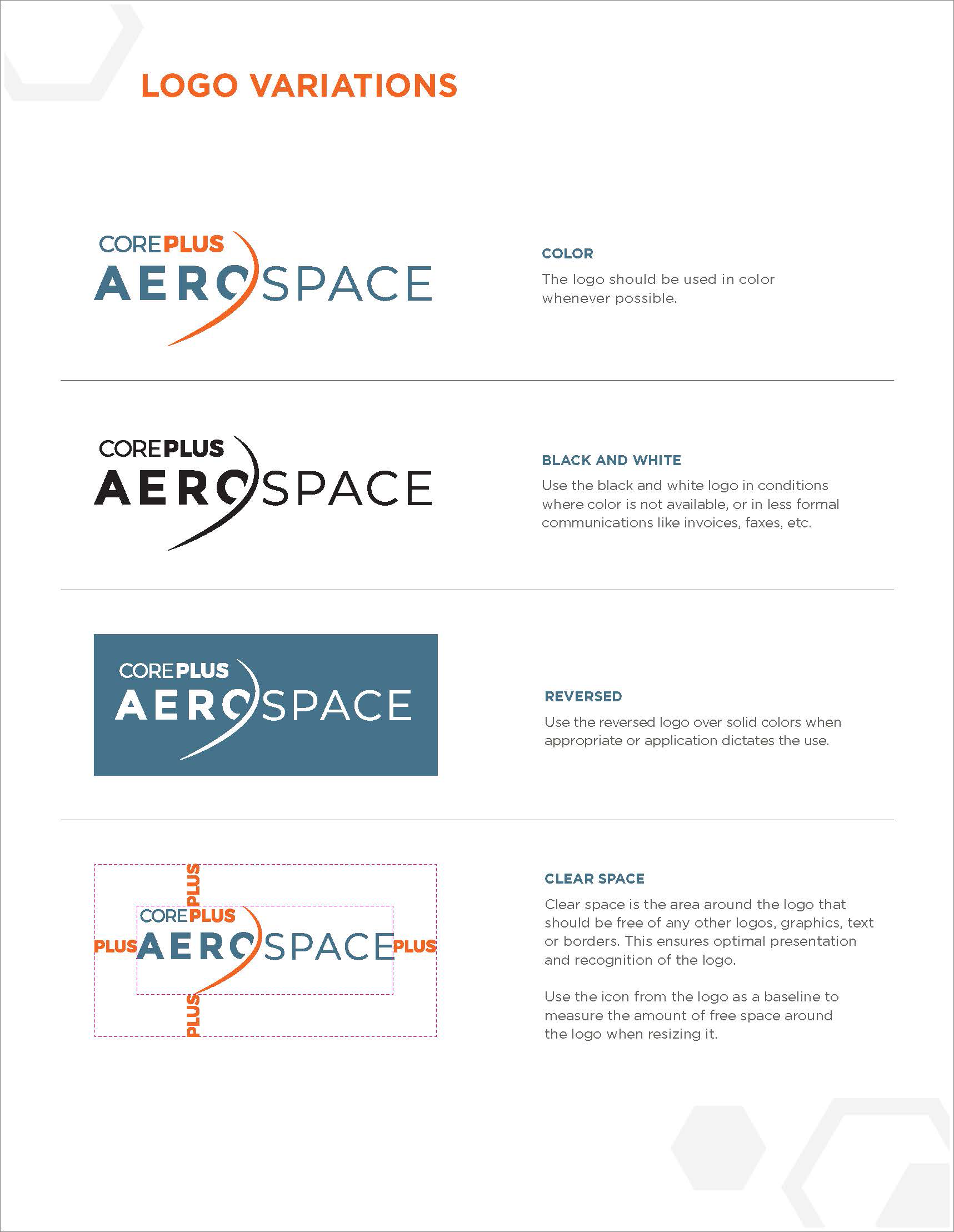
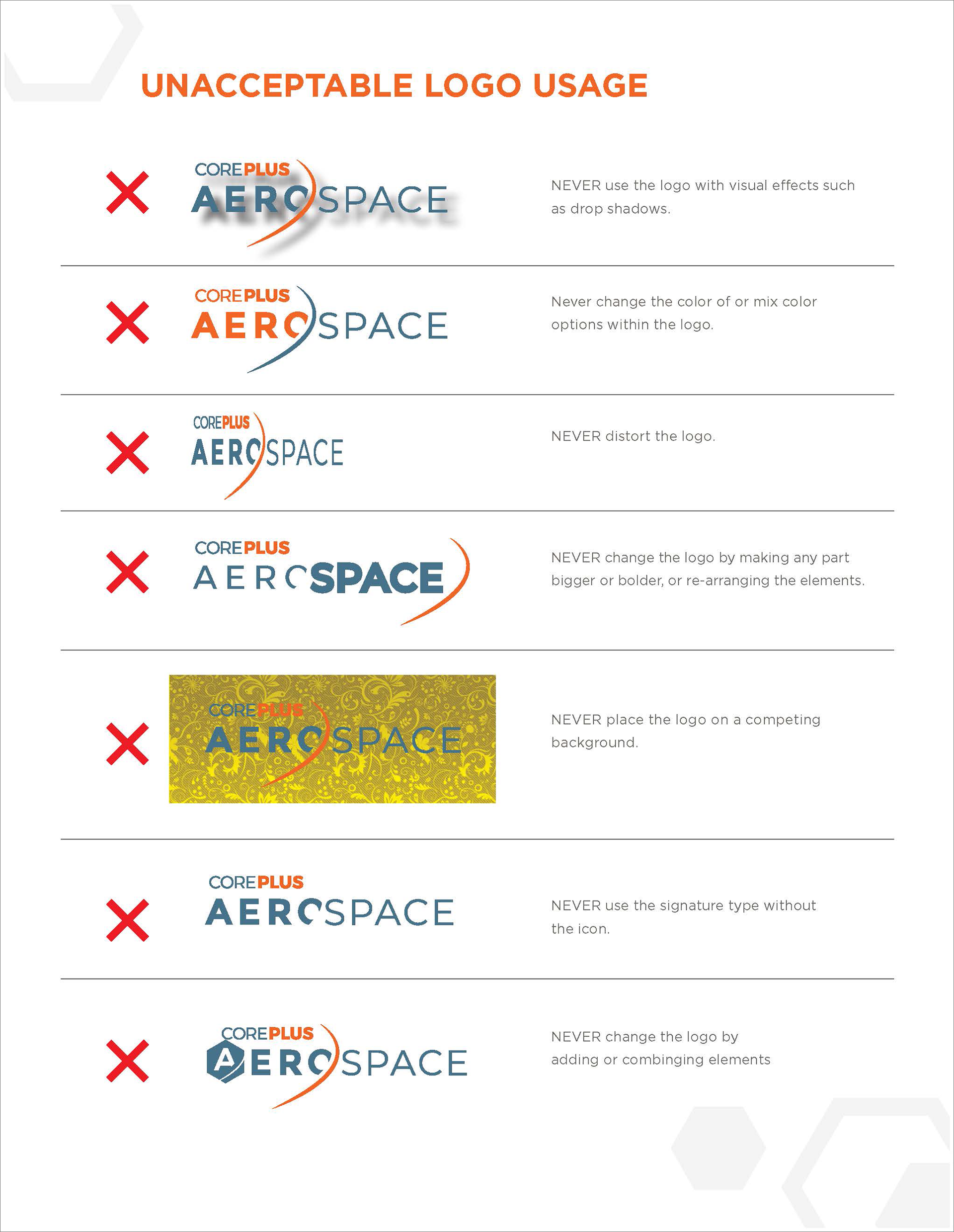
Brand Guidelines
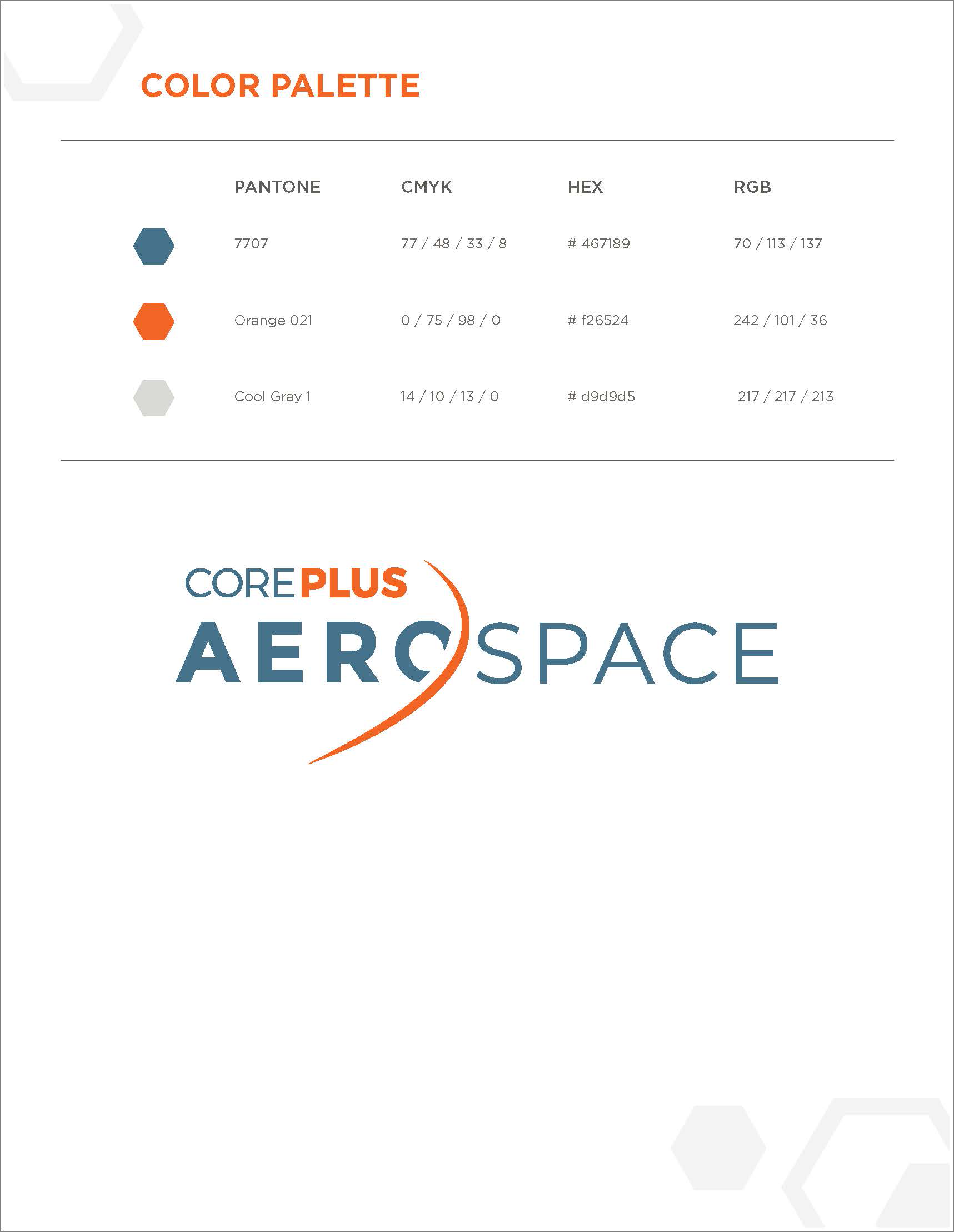
The Challenge:
Without formal guidelines, internal stakeholders were applying logos and colors inconsistently, diluting brand coherence.
My Role & Process:
• Developed clear rules for selecting horizontal, vertical, and icon-only logo variations.
• Defined minimum sizes, clear space, and unacceptable treatments to avoid misuse.
• Established primary and secondary color palettes for print and digital, with CMYK and RGB/Hex values, ensuring accuracy across applications.
• Created visual examples for proper usage and misuse (e.g., overlaid on busy backgrounds, improper color combinations).
• Specified color codes for print (CMYK) and digital (RGB/Hex), including accessible contrast alternatives.
The Outcome:
The guidelines provided structured, easy-to-use standards that created consistency across all materials, gave stakeholders confidence in maintaining the brand identity, and ensured clarity and control over the brand’s visual expression across marketing materials.
Brand Expression: Parent Brochure
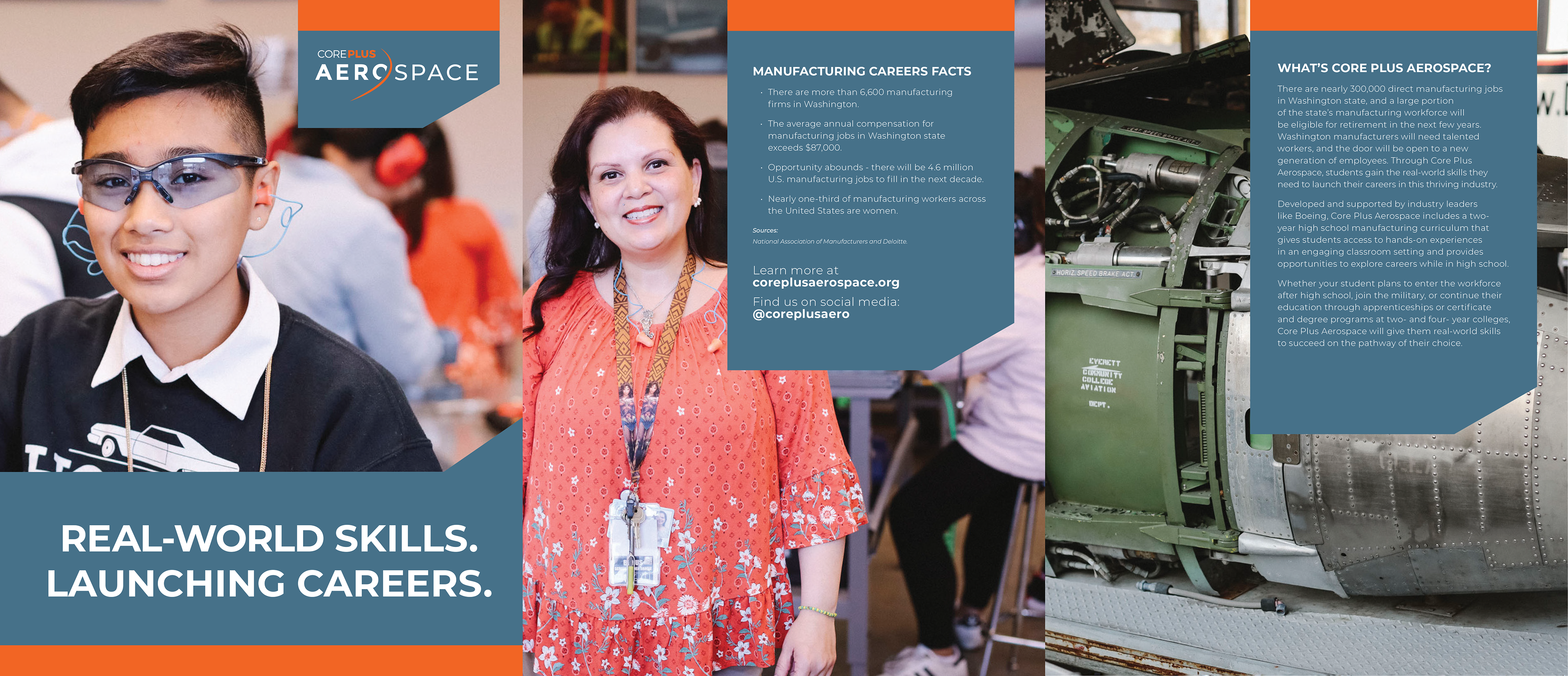
Brochure: Front
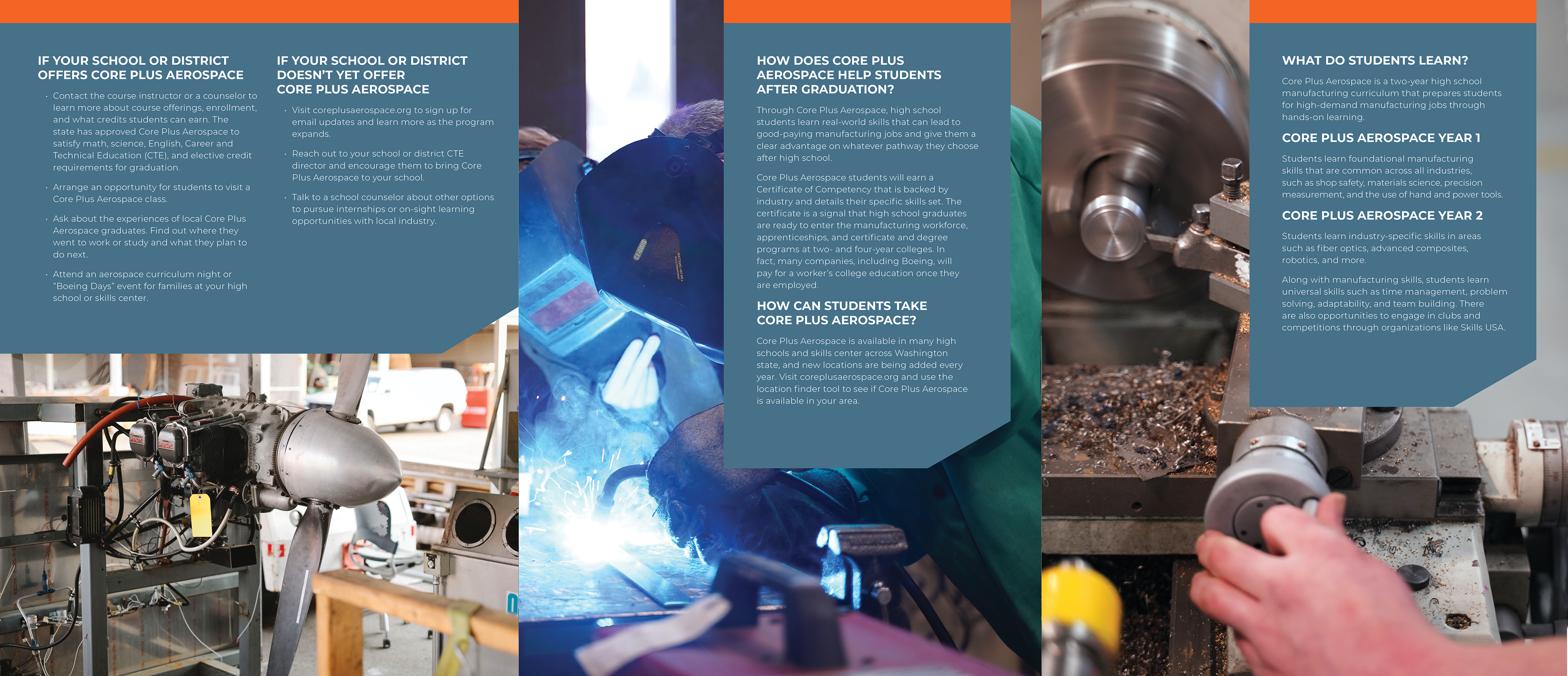
Brochure: Back
The Challenge:
Parents needed a simple, visually engaging explanation of the program’s benefits and how it works.
My Role & Process:
• Designed both front and back layouts with consistent branding, clear copy hierarchy, and inviting visuals.
• Emphasized aspirational messaging alongside practical information, balancing emotion with clarity.
The Outcome:
The brochure served as a compelling touchpoint that supported recruitment and program understanding, bridging informational and emotional needs.
Brand Expression: Flagship Infographic
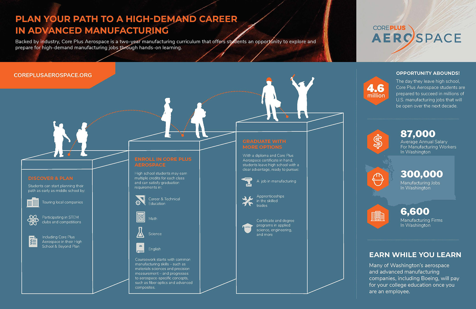
Flagship Infographic
The Challenge:
The program structure includes complex pathways (curriculum years, technical vs. core content, downstream outcomes).
My Role & Process:
• Designed an infographic with a clear visual hierarchy, icons, flow, and color coding to represent curriculum flow.
• Ensured clarity at various sizes and applications — from digital slides to printed handouts.
The Outcome:
The infographic not only clarified the program flow but became a brand anchor reused in collateral, presentations, and marketing materials.
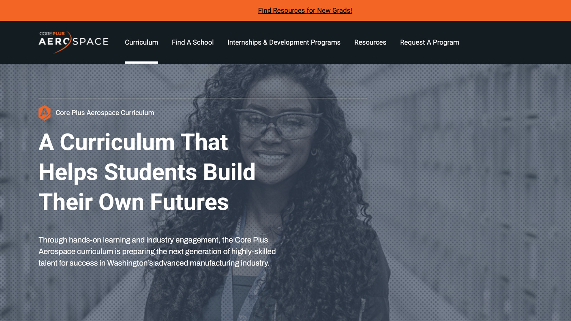
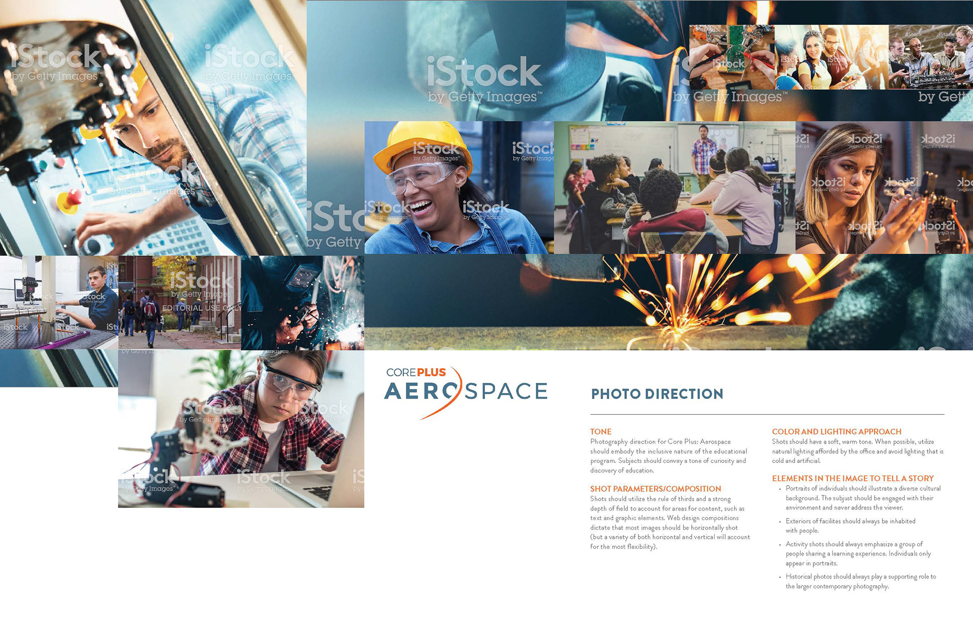
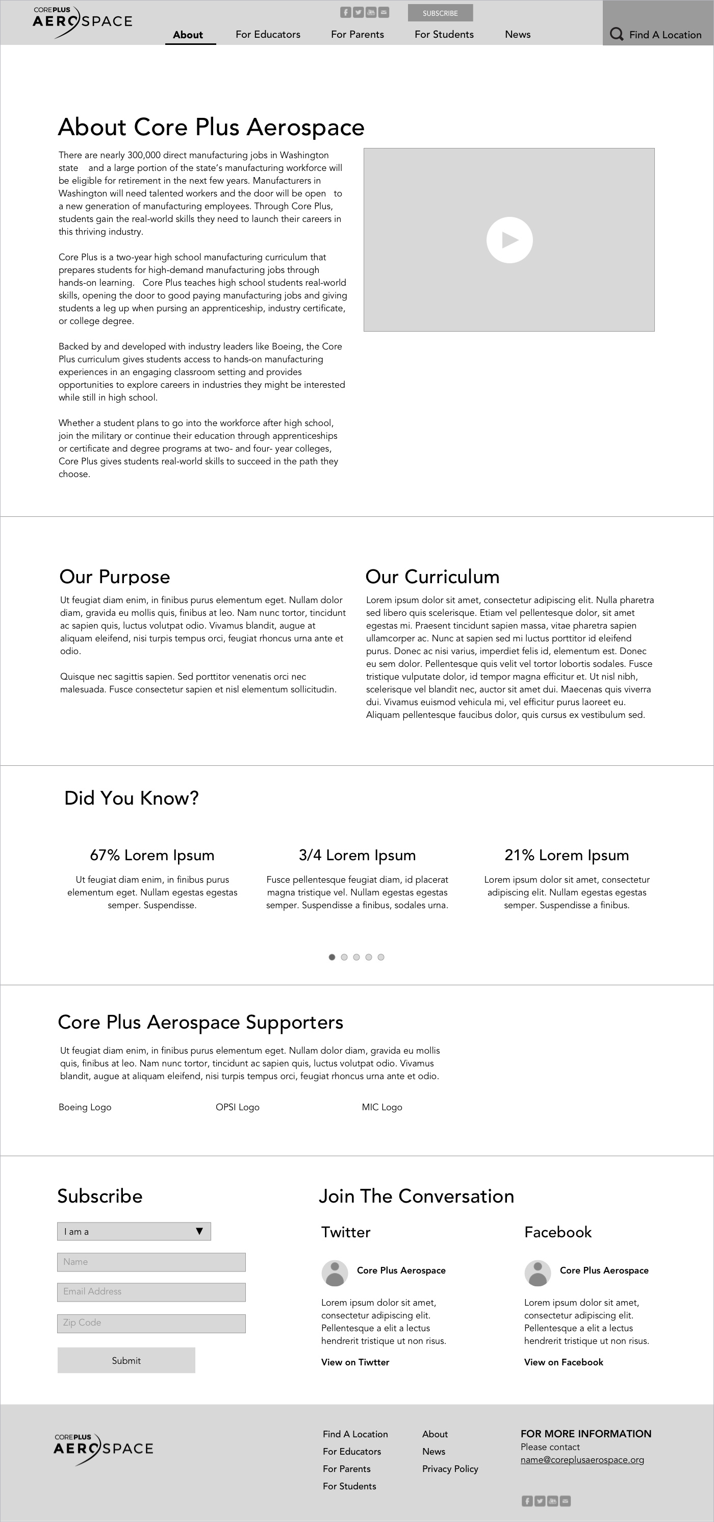
Brand Expression: Website
The Challenge:
CorePlus Aerospace needed a website that could clearly communicate its program value to multiple audiences — students, parents, educators, and industry partners. The existing site lacked hierarchy, engaging visuals, and a clear user path through the content.
My Role & Process:
Information Architecture
Reorganized program content into clear pathways for each audience.
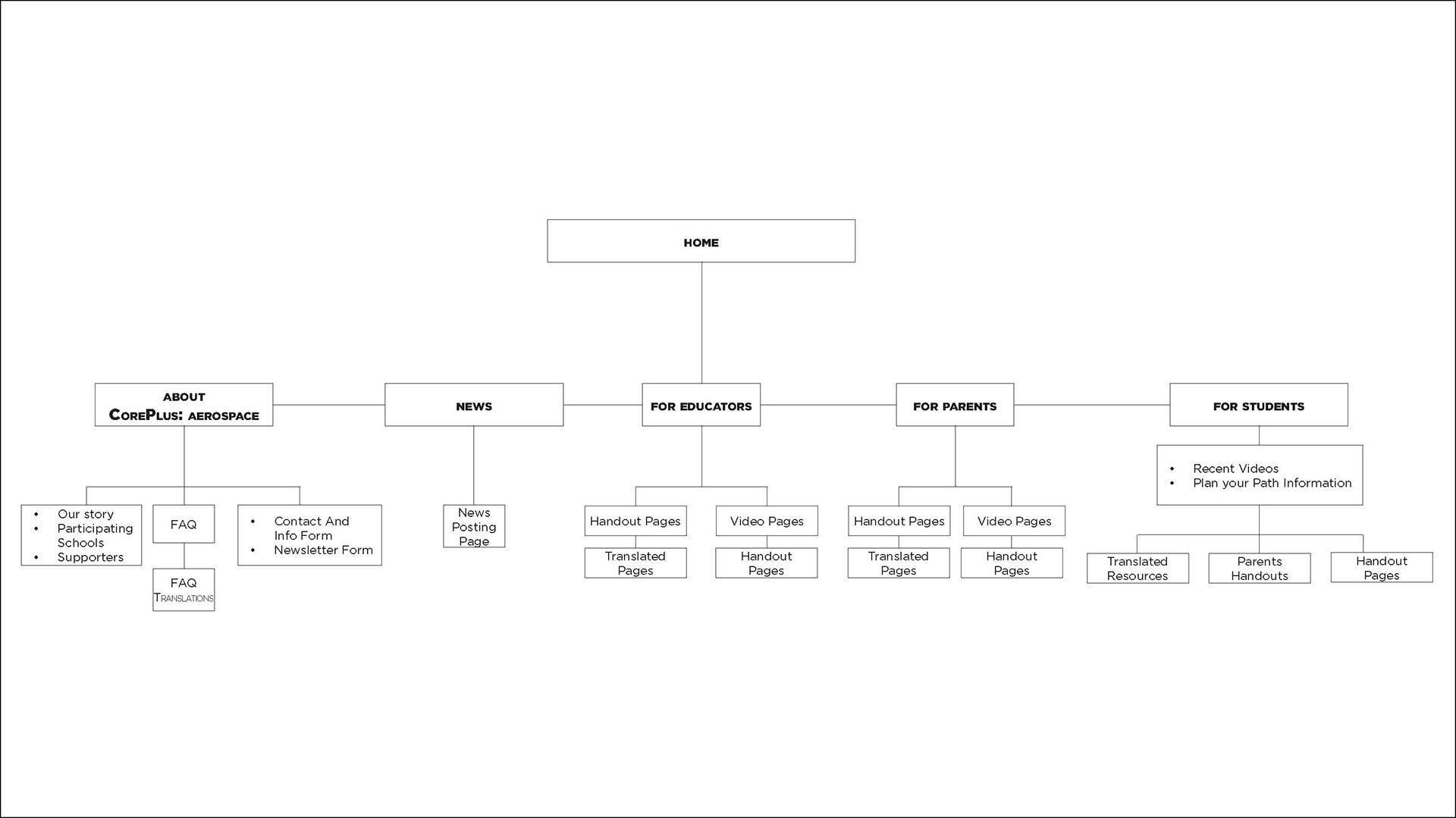
Photo Direction
Guided image selection to balance aspirational storytelling with practical program details.
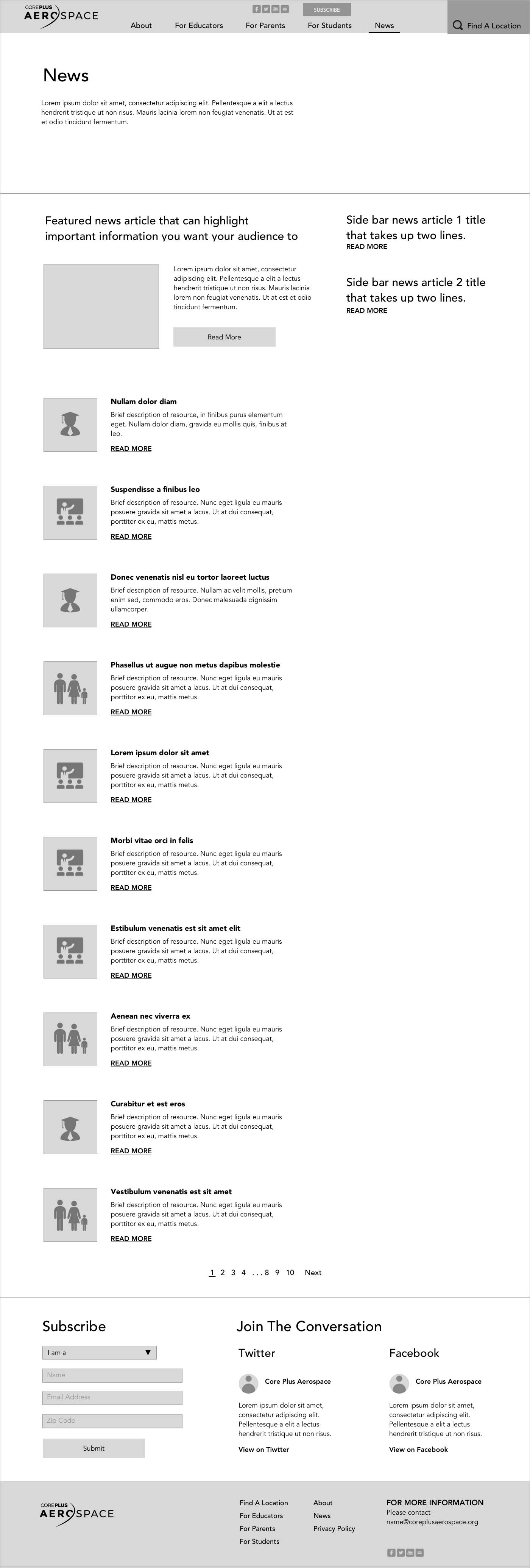
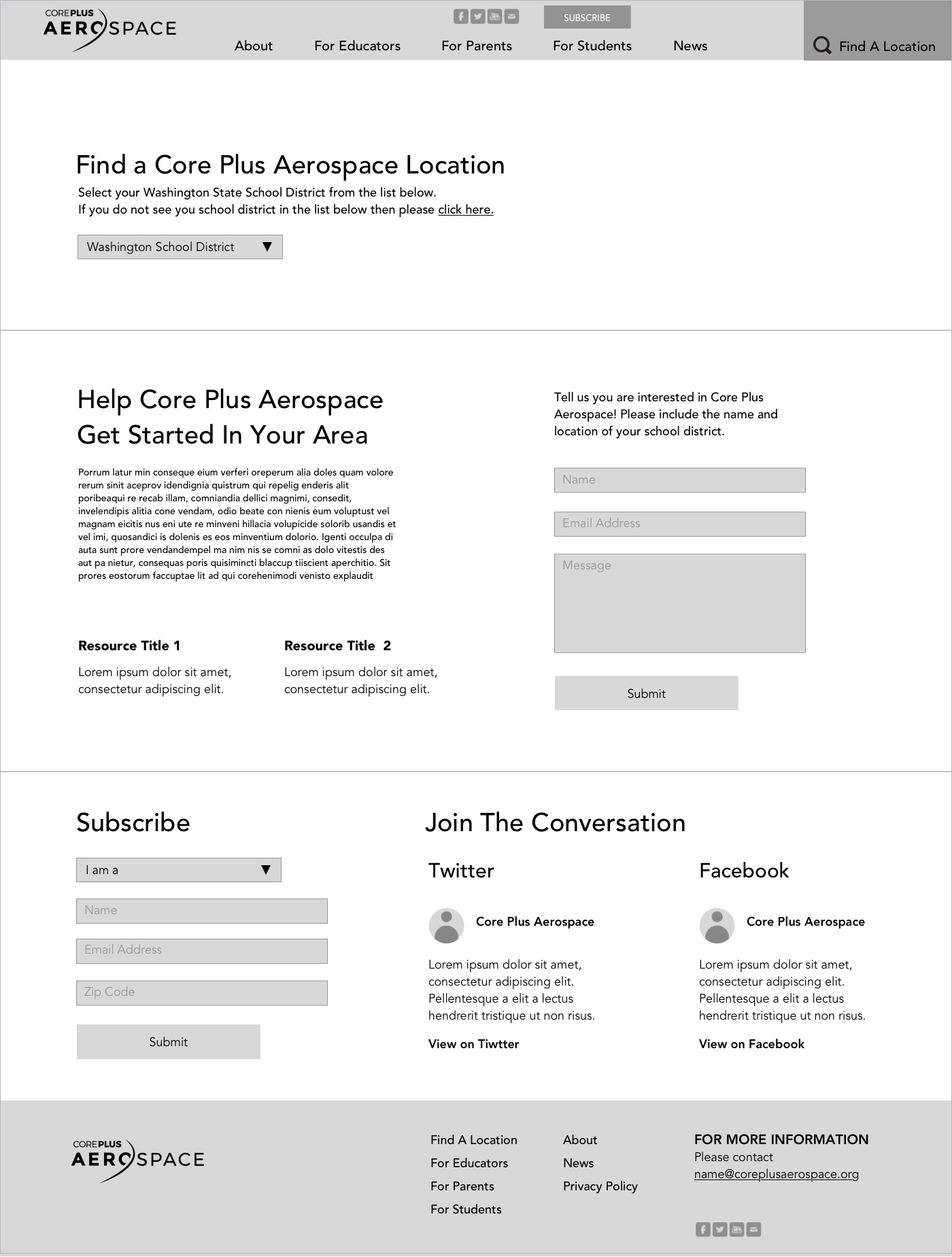
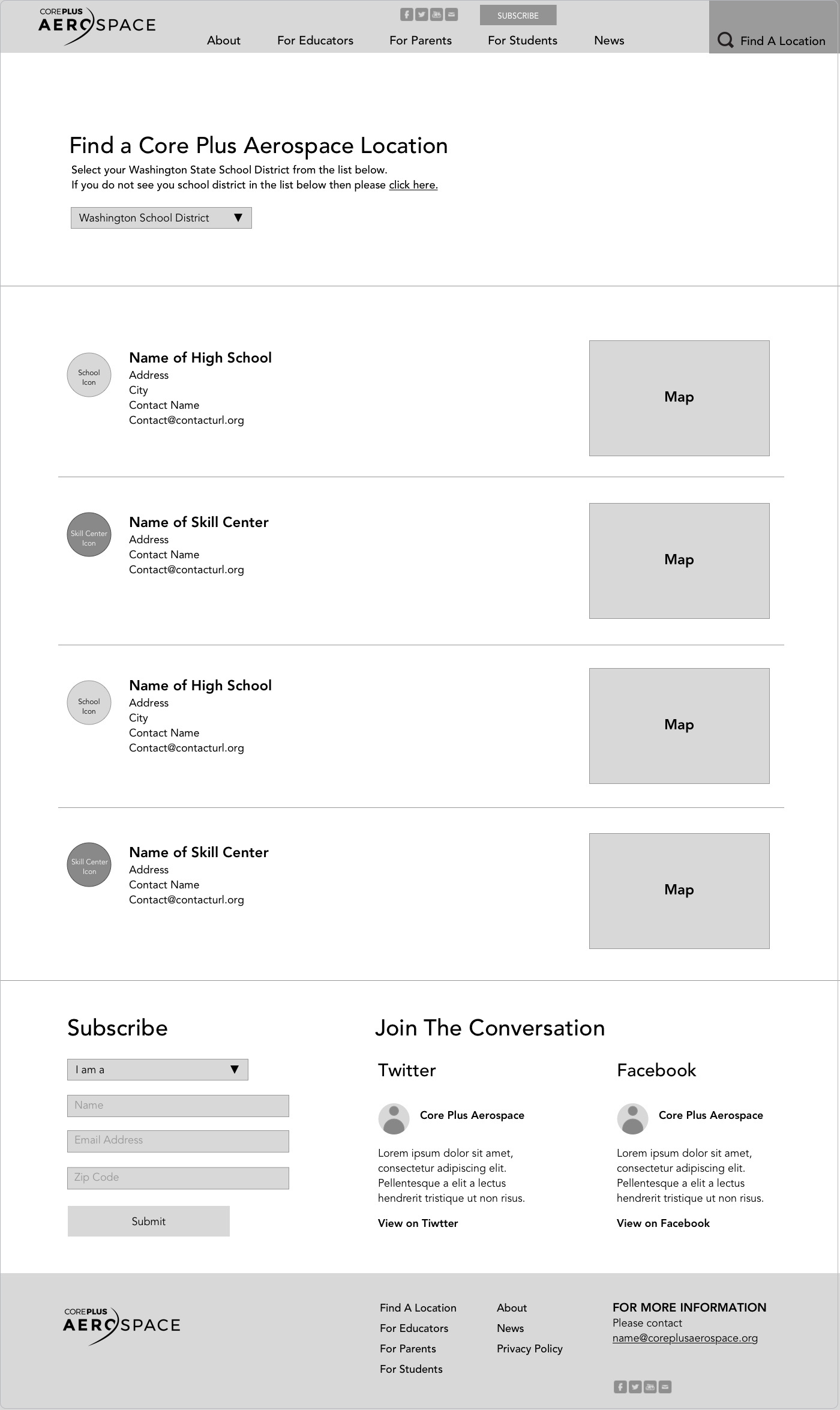
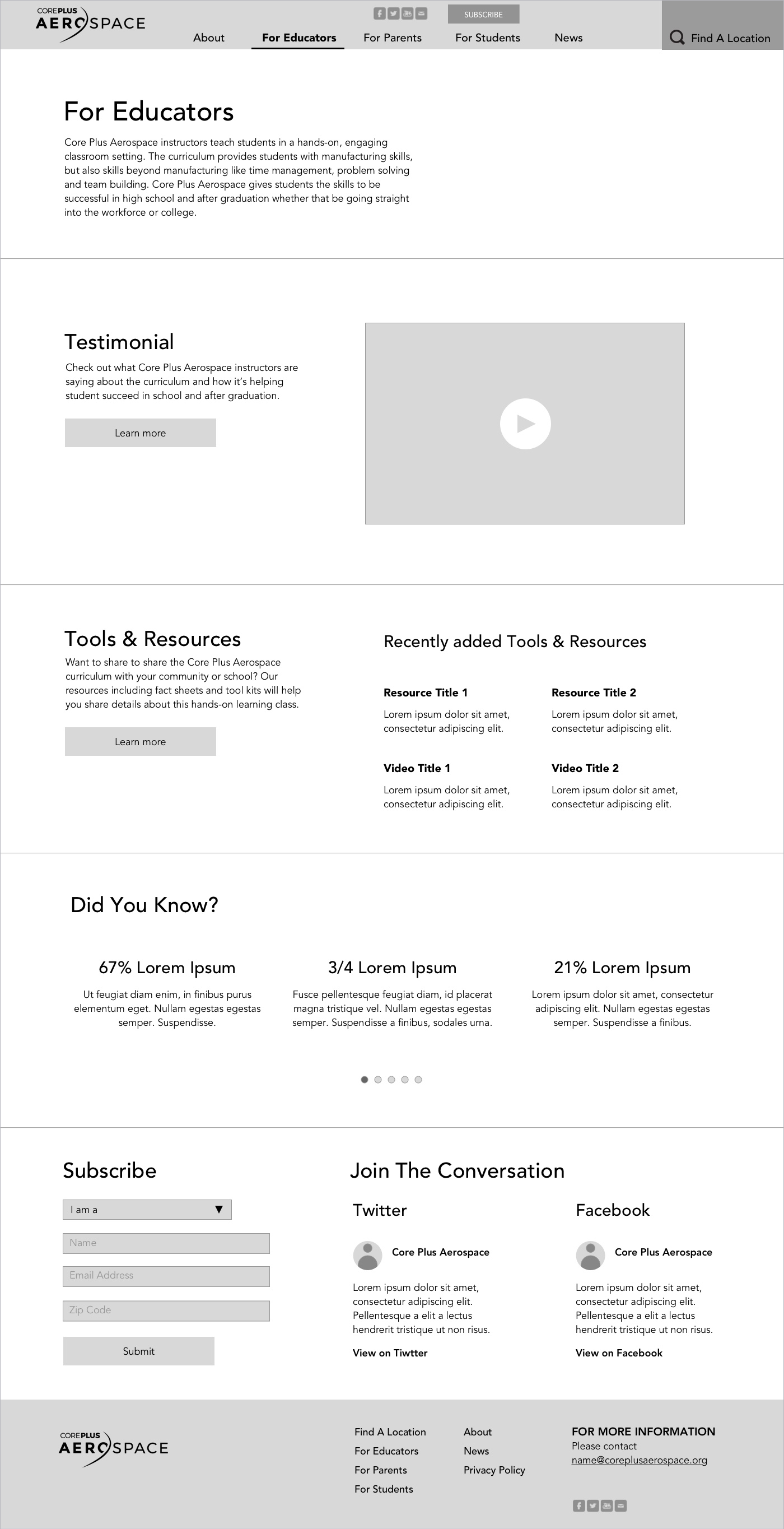
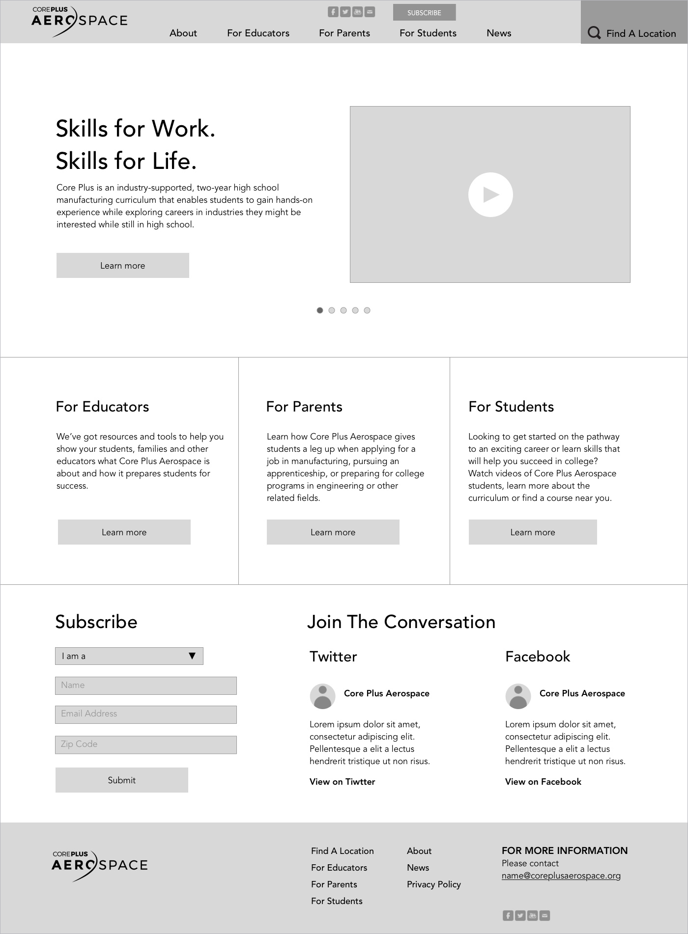
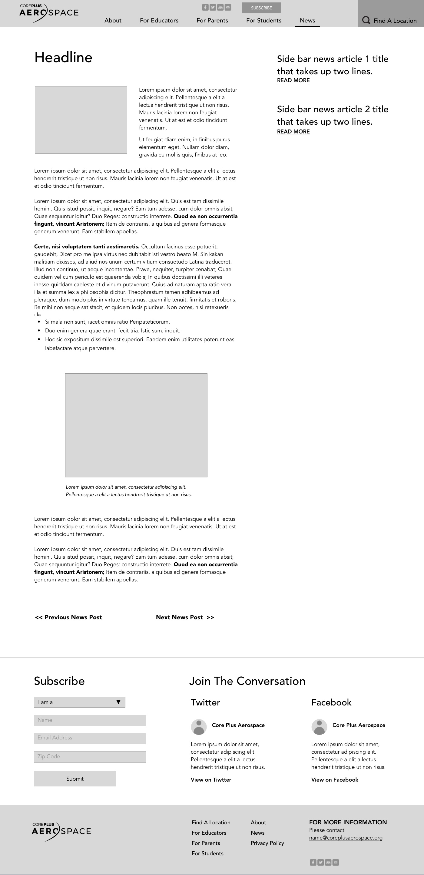
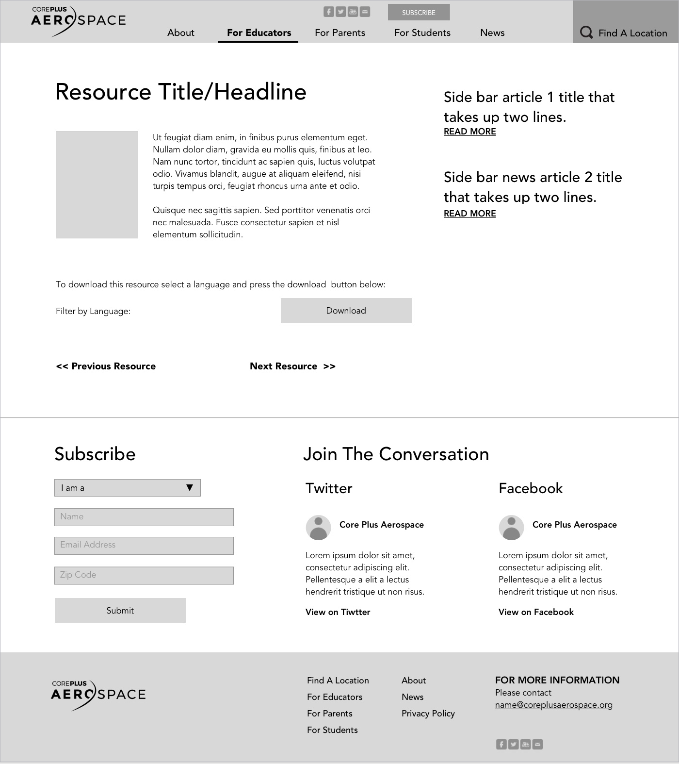
Wireframes
Produced multiple low‑fidelity wireframes to test layout, hierarchy, and navigation before design.

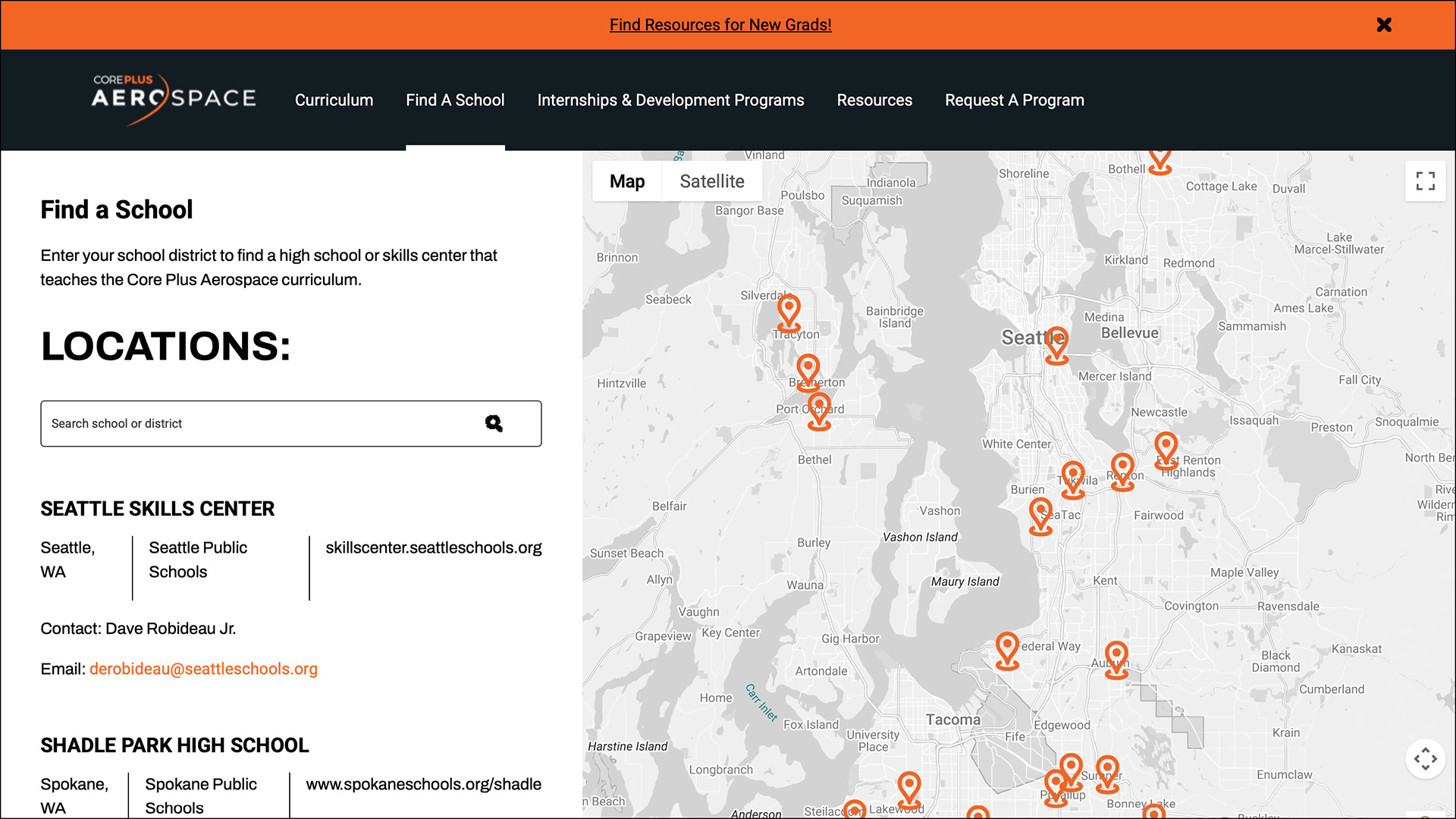
Live Website
The site is now live and serving Washington students.
The Outcome:
The final website provided a cohesive digital platform that showcased program benefits clearly, improved navigation for all stakeholders, and reinforced the brand’s updated visual identity.
Key Contributions
• Reframed visual identity from a fragmented logo into a coherent, scalable system.
• Authored brand guidelines that empowered consistent, accurate usage across channels.
• Designed parent-facing collateral with balanced messaging and inviting design.
• Developed an infographic that served as the foundational visual map for the entire brand ecosystem.
• Created a user‑friendly, responsive website that unified program communication for multiple audiences.